
Why TVA's Grid is Greener than Greens Grant
The Tennessee Valley Authority is "one of the dirtiest utilities" according to many environmental nonprofits and to their sympathetic journalists, politicians, and wonks. They're all wrong.

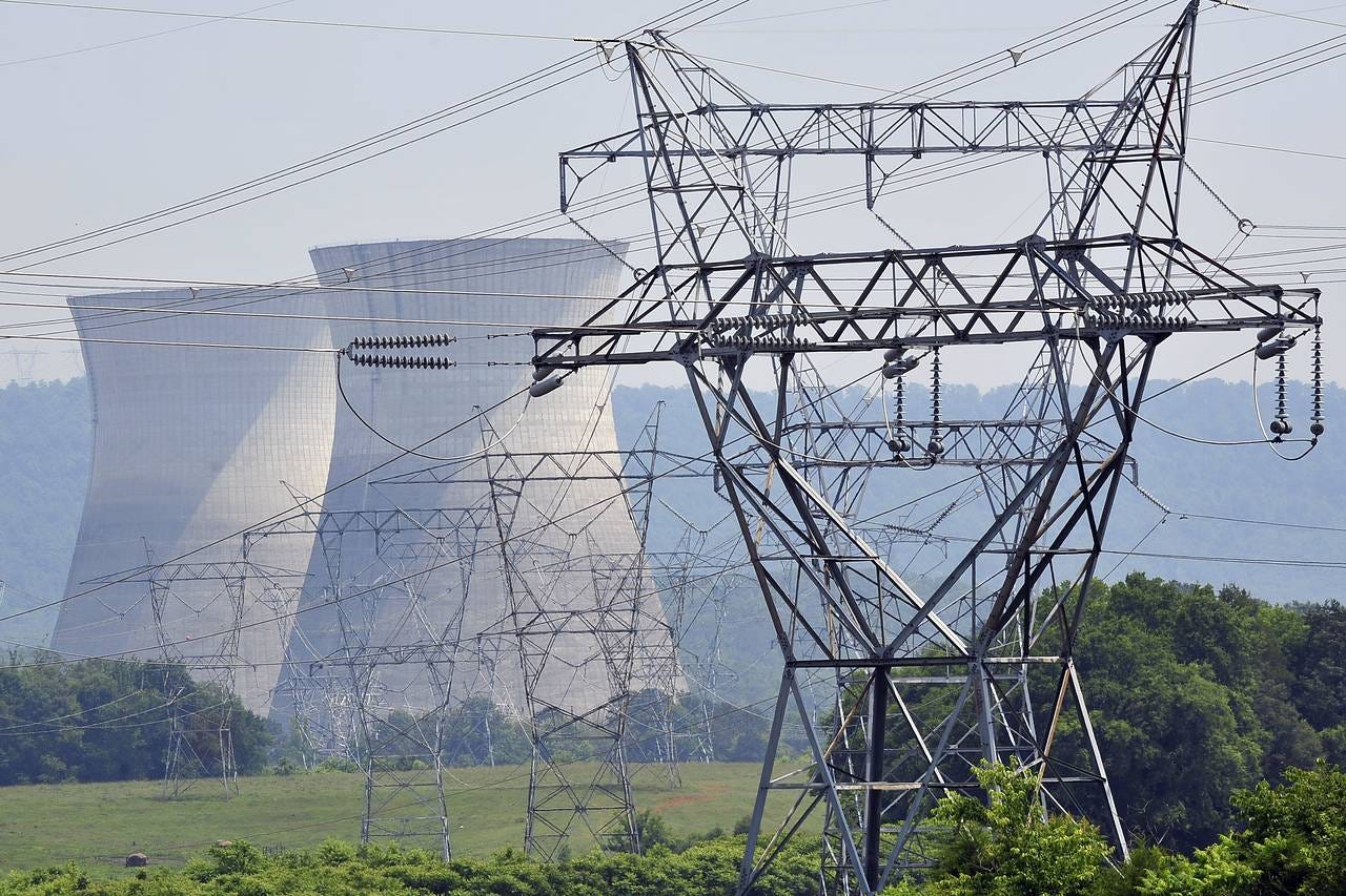
More often than not, when you hear about the Tennessee Valley Authority these days, it’s something about TVA giving the middle finger to the earth by building new gas plants, due to its “fossil fuel agenda,” while dragging its feet on renewables. The TVA, of course, is the federally-owned public power system set up during the New Deal and still kicking over 90 years later.
“The biggest public utility in the U.S. is also one of the dirtiest,” claims Evergreen Action. TVA gets an “F” from the Sierra Club and, according to the Center for Biological Diversity, it’s “obstructing the clean energy transition and serving as a poster child for dangerous, fossil fuel-burning utilities.”
Many of these assessments from Green groups and their aligned environmental reporters also include data that purports to quantify how much TVA is a fossil-fueled nightmare. Numbers surely don’t lie, right?
As it turns out, the latest such article that I’ve come across, from Nashville’s NPR outlet, makes exactly the error I described in my previous post. There, I pointed out the misleading nature of common rhetorical claims about a state’s electricity generation, and I argued instead for basing claims about carbon intensity of electricity on the physical power system. That in turn requires that we look not at state borders but at the balancing authorities of the grid, each doing the magical work of operating the grid for their own discrete portion of it.
I’ll return to that specific NPR error further down, but first let’s look at some general facts about TVA’s power.
TVA’s power is far from one of the dirtiest
Among all the extreme rhetoric about TVA from Green groups, it’s rare to see an analysis of the actual carbon intensity of TVA’s balancing area in comparison to other balancing areas of the grid. Let’s take a look:
The chart above shows the average carbon intensity of consumed electricity for the 10 largest balancing areas in the U.S., for roughly the past six years.1 As you can see, TVA is far from a dirty outlier. One could argue that the line for TVA is not trending downward enough, like ERCOT’s for example. But it’s simply absurd to argue that it’s one of the dirtiest.
Averaging across the whole six years, TVA comes in at #5, and it’s still #5 if you look only at the past year; in both cases it has lower carbon intensity than the large BAs it neighbors: MISO, PJM, and SOCO.
For those of us concerned with decarbonization, reducing the carbon intensity of electricity consumption is the whole point, right? But that’s a tricky metric, one that depends on estimates of “emissions factors” for each generation type.2 For many Green groups, however, the point is “more renewables, less fossil fuels.” So let’s instead break down the generation mix inside each of these 10 largest BAs to see, on average, how much local generation (i.e. within the BA itself) is provided by each generator type:
Here, too, we can see that TVA has a lower share of fossil-fueled generation than all but CISO, more commonly referred to as CAISO, the California Independent System Operator. That’s despite having the least wind and solar generation of the 10 largest BAs.
TVA had cleaner power than neighbors in recent heatwaves
June and roughly the first half of July saw very high temperatures across Tennessee and the rest of the TVA territory. Higher temperatures means more air conditioning and more electricity demand — and perhaps calling more on gas-powered plants. So how did TVA’s carbon intensity compare to its neighboring balancing areas during that period? Once again, favorably, even compared to wind-heavy MISO.
Similarly, we can see that over the same period, TVA had a higher share of carbon-free generation than did MISO. It’s important to note that the share of wind and solar generation in MISO is far higher than that of TVA — in this period, but also in general. That’s because TVA’s carbon-free generation is predominantly nuclear and, to a lesser extent, hydropower.
Shining light on a dirty Green analytical trick
In that previous post of mine that highlighted the importance of analyzing the physical grid, not state data about generators, I concluded with the following:
When it comes to carbon intensity of electricity, a region’s generators do not tell the whole story of that region’s electricity as a consumed service. That’s because that service is the result of the work of a balancing authority using all the resources at its disposal, including interchange with its neighbors.
“Did you know Vermont’s electricity is the cleanest in the nation?” Hopefully now you’re better equipped to understand — and rebut — a misleading claim like that.
In the recent report I mentioned at the top, the one castigating TVA, journalist Caroline Eggers at Nashville’s local NPR affiliate purports to argue that South Dakota and Texas both have cleaner energy — energy that’s less dependent on fossil fuels — than the TVA:
South Dakota got 84% of its in-state electricity generation from renewables in 2022, while even fossil-heavy Texas generated 31% of its power from solar, wind and geothermal. TVA, which provides nearly all of Tennessee’s electricity, produced virtually zero non-hydro renewables last year and got 4% of its electricity needs from purchased solar and wind.
Using the tools and datasets I detailed in the previous post, I will rebut this misleading comparison. (There are other misleading statements in the report, but I’m focusing only on the power system claims.)
States don’t provide electricity; balancing authorities do
“South Dakota got 84% of its in-state electricity generation from renewables in 2022.” In other words, using EIA data, she shows that among generators located in SD, 84% of their total produced energy came from generators that were renewable.
But the electricity that “South Dakota got” did not come only from generators in the state’s borders. In fact, there’s a clear lopsidedness, as SD’s generators produce way more electricity than what is used in the state — 17.9 GWh vs. 10.9 GWh3 — meaning that a huge chunk of that renewable energy is exported out of state, in a sense.
As I’ve argued, we must look instead to the electrical balancing areas, the grid operators that do the work of balancing electrical resources and providing electricity service for their territory. The “extra” energy generated in South Dakota simply acts as a resource in the larger mix of some balancing authority.
South Dakota’s utilities, from which people and businesses purchase electricity in the retail market, straddle three different balancing authorities:
Midcontinent Independent System Operator (MISO)
Southwest Power Pool (SWPP)
Western Area Power Administration - Rocky Mountain Region (WACM)
Each utility in SD sells electricity that is the product of one of these BAs. That means we can look at all the retail electricity sales by the state’s utilities and proportionally allocate them to the BAs those utilities are part of.
For example, using EIA Form 861, the latest data of which covers 2022, we see that the BA whose in-state utilities’ retail sales are the largest is SWPP, with 4,812,004 MWhs, which covers about 44% of all such sales in the state.
Next Eggers gives a similar claim about Texas: “… even fossil-heavy Texas generated 31% of its power from solar, wind and geothermal.”4 Let’s do the exact same breakdown for Texas as with South Dakota, resulting in the BAs:
Electric Reliability Council of Texas (ERCO aka ERCOT)
Southwest Power Pool (SWPP)
Midcontinent Independent System Operator (MISO)
El Paso Electric (EPE)
ERCOT covers 87% of the state’s retail electricity sales, with SWPP a distant second at 7%.
The chart above puts the two states together, showing us roughly how much of each state’s electricity usage — how much of the total retail electricity sales to residential, commercial, and industrial customers by the two states’ utilities — comes from a handful of BAs.
TVA operates a cleaner grid than balancing authorities serving South Dakota and Texas
Now that we’ve seen how electricity consumed in South Dakota and in Texas actually comes from BAs, we can compare the carbon intensity — as a property of the electricity service provided by the physical power system — between those BAs and my favorite BA, the Tennessee Valley Authority’s. The following chart uses the EIA data described in my previous post to depict average carbon intensity of consumed electricity by BA:
Plain as day, one can see that TVA’s BA is cleaner than every BA serving South Dakota and Texas. These numbers reflect the average daily carbon intensity of electricity consumed in each BA, for the year 2023.
Eggers though didn’t go so far as to talk about carbon emissions, just local generation mixes. Once again, the key error she made — the focus of my previous post — was looking at the share of generation within states rather than within balancing areas serving those states. That meant the cited figures were divorced from the reality of how electricity service is provisioned and consumed.
But one still might be interested in the generation mixes of the BAs. Earlier we already saw that TVA had a lower mix of fossil-fueled generation than eight of the other nine largest BAs, which included ERCO, SWPP, and MISO. The remaining BAs powering South Dakota and Texas — WACM and EPE — also have a much higher mix of fossil-fueled generation than does TVA; here’s the chart.
Though it’s obviously correct to argue that other BAs have more wind and solar power, the picture Eggers paints — of TVA and its “fossil fuel agenda” — is utterly misleading.
Why all the Green interest in criticizing TVA for being “one of the dirtiest utilities in the U.S.”? Essentially, there are two core reasons. First, it’s because TVA has relatively low wind and solar power, the Greens’ preferred (and market friendly!) way to produce low-carbon power. Second, it’s because TVA deigns to build more gas-powered generators — which, in some cases, necessitates new gas pipeline extensions.
Why would TVA be building more gas power? “We’re in a climate crisis!” the groups tend to say. I’ll save a more detailed discussion about it for another time, but until then, one should note that the balancing areas that Greens argue in favor of, the ones with more wind and solar power, have a larger share of coal-, gas-, and oil-powered generation, as we saw above. Maybe adding more gas plants in TVA — especially when they displace retiring coal plants and come with big new investments in clean power — is not the villainous, unjustifiable act the Greens make it out to be?
The top 10 largest by the total installed generation capacity. EIA’s carbon intensity data only goes back to 2018.
In my previous post I glossed over this aspect of the “flow tracing” method of calculating carbon intensity for BAs. Since we don’t have measured emissions data or generator-level data to work with in the hourly BA datasets from the EIA — we instead only have total generation by type — we need to calculate the estimated CO2 emissions by generator type. These are called “emissions factors.”
The former figure comes from EIA’s electricity browser while the latter comes from the Form 861 data, explained just below the noted text.
Note that the cited source for Eggers’s claim performs a more careful dance with the “31%” figure, twisting it into something technically accurate but not entirely clear [emphasis mine]: “Texas produced the equivalent of 31% of the electricity it consumes from solar, wind and geothermal power.”